
MIONIX
Design & Visualization Partner
YEAR:
2021/2022
BRAND / CLIENT:
MIONIX
ROLE:
LEAD DESIGNER & VISUALIZER

SUB-PROJECT
HEADPHONE FAMILY
ROLE:
LEAD DESIGNER
STATUS
CONCEPTS READY FOR ENG. DEVELOPMENT
Scope:
"Design a family of headphones comprised of 3 different styles and connection interfaces."
GAMING
USB
Techy
LED/RGB
Niche target group
Advanced functions
Modular/Customizable
STREET
BLUETOOTH
Clean/Minimalistic
Modern
Intuitive
For "The masses"
ANALOGUE
3.5mm
Moodboards defining the design direction, aligned with Mionix' wishes.


Research
To better understand the products, but also be able to objectively guide decisions in the project.
Research sources:
- Blogs / Vlogs
- Reviews
- Scientific papers
- Competitive analysis through product testing


Synthesis

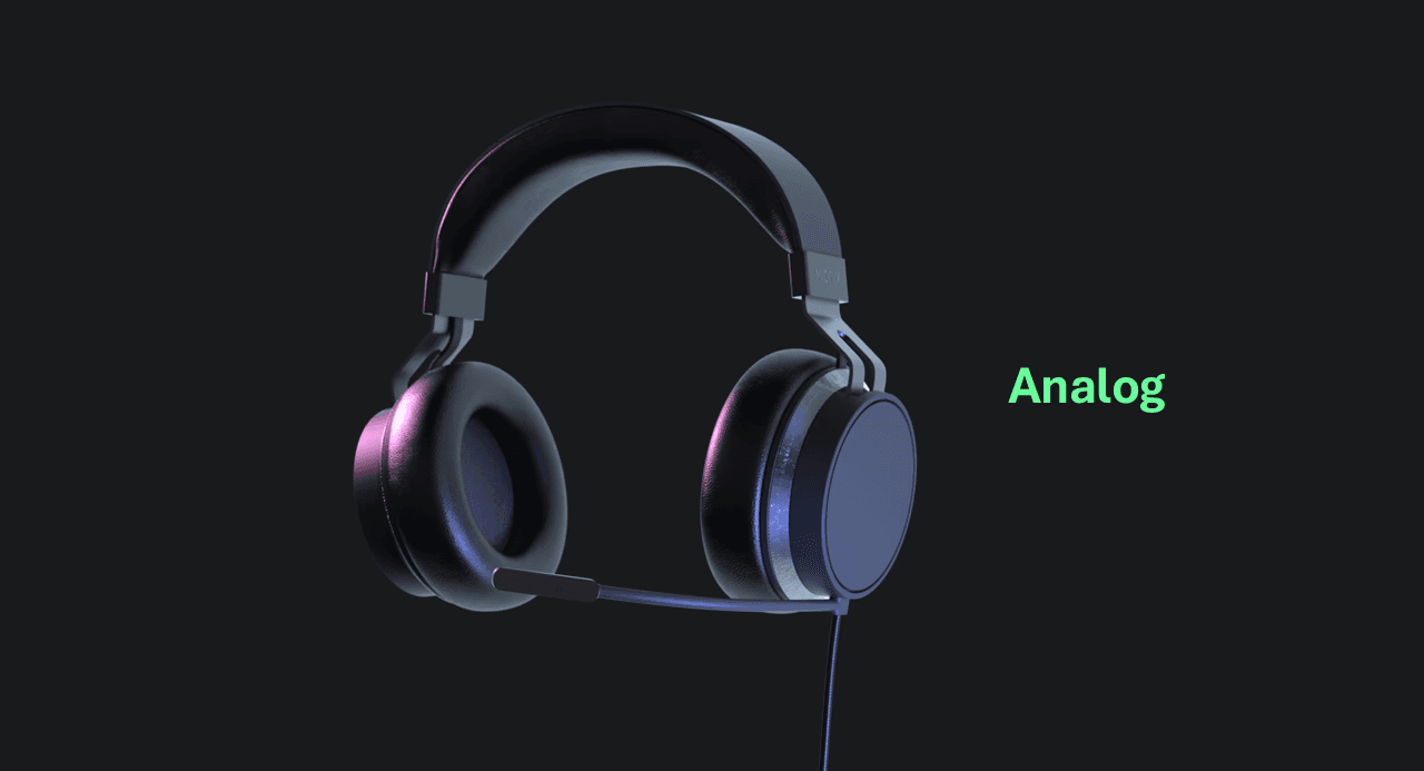


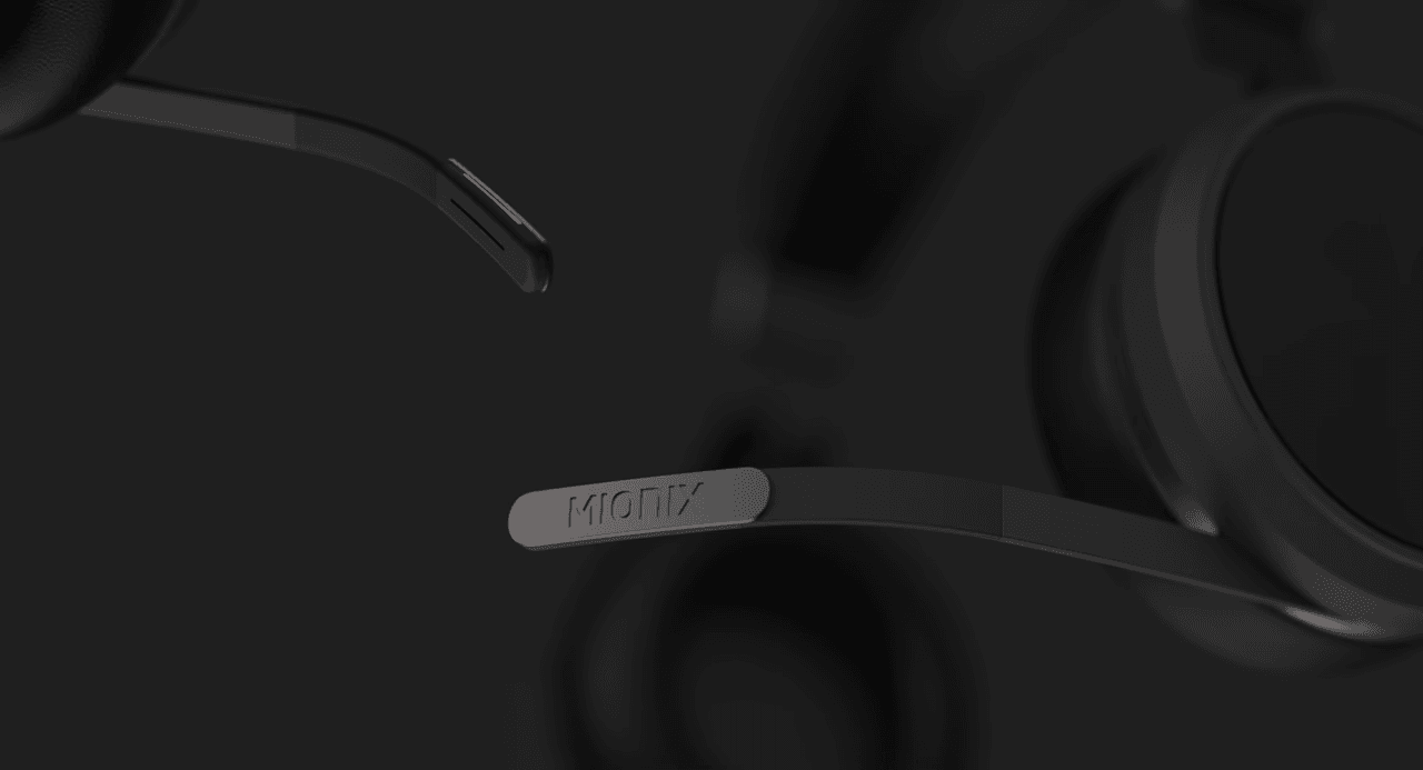


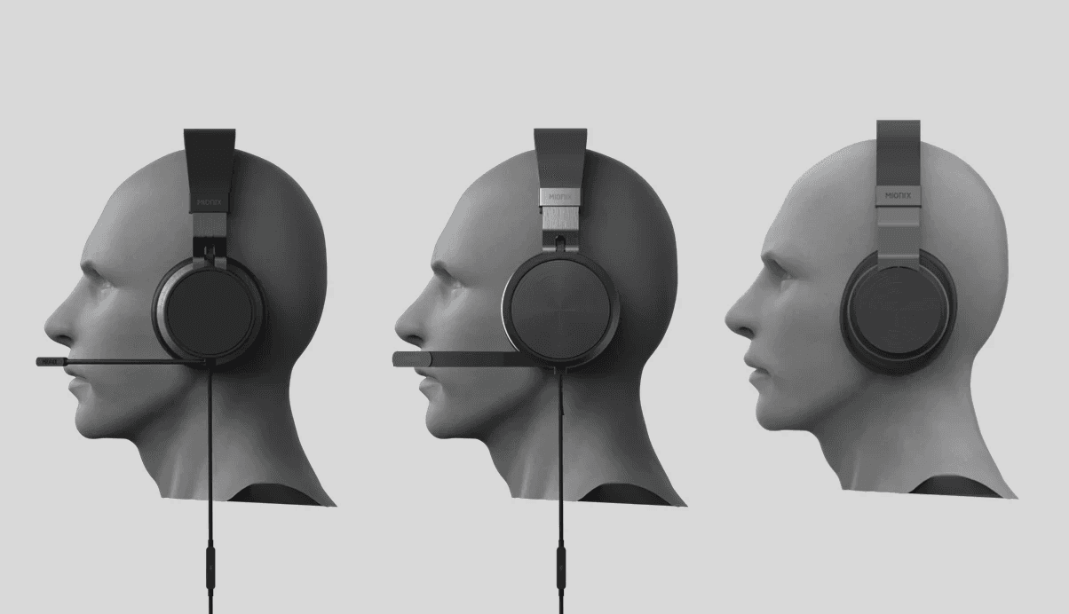
Analogue
Gaming
Street
Scope Change / Phase 02
The client needed to prioritize resources and the focus narrowed to the core business:
Gaming
with the brief to design an even chunkier, more rugged gaming aesthetic.


Once the Phase 01 design was aligned with the client, I 3D printed it to check fit and proportions in hand. Testing it with a colleague in the studio pointed toward a new direction, which the client and I then confirmed together:
Less visual bulk
Bolder expression
More "Gaming"


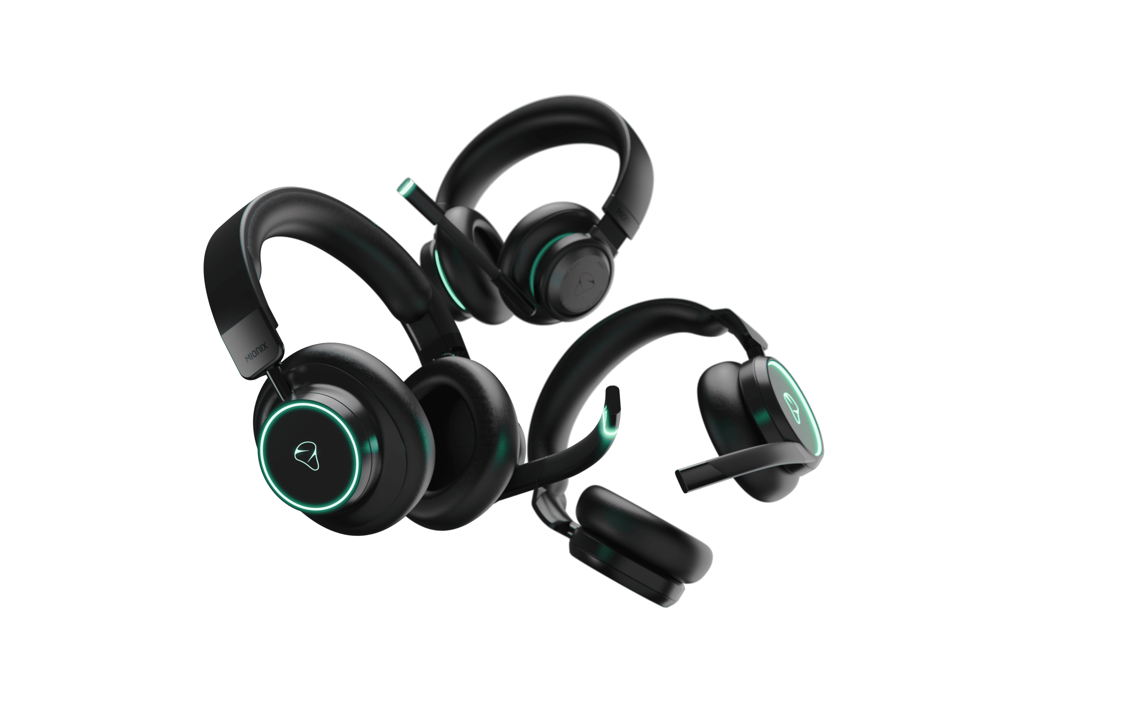
3 Concepts
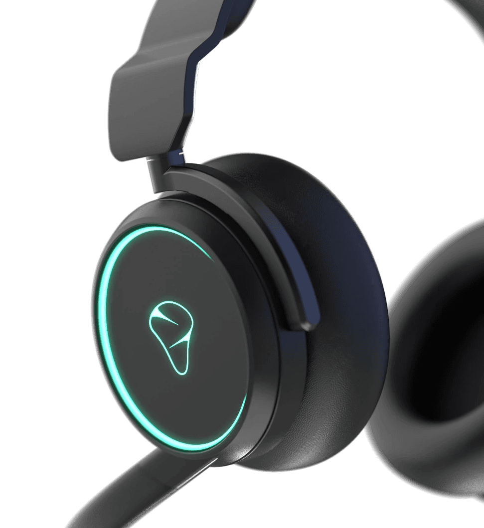

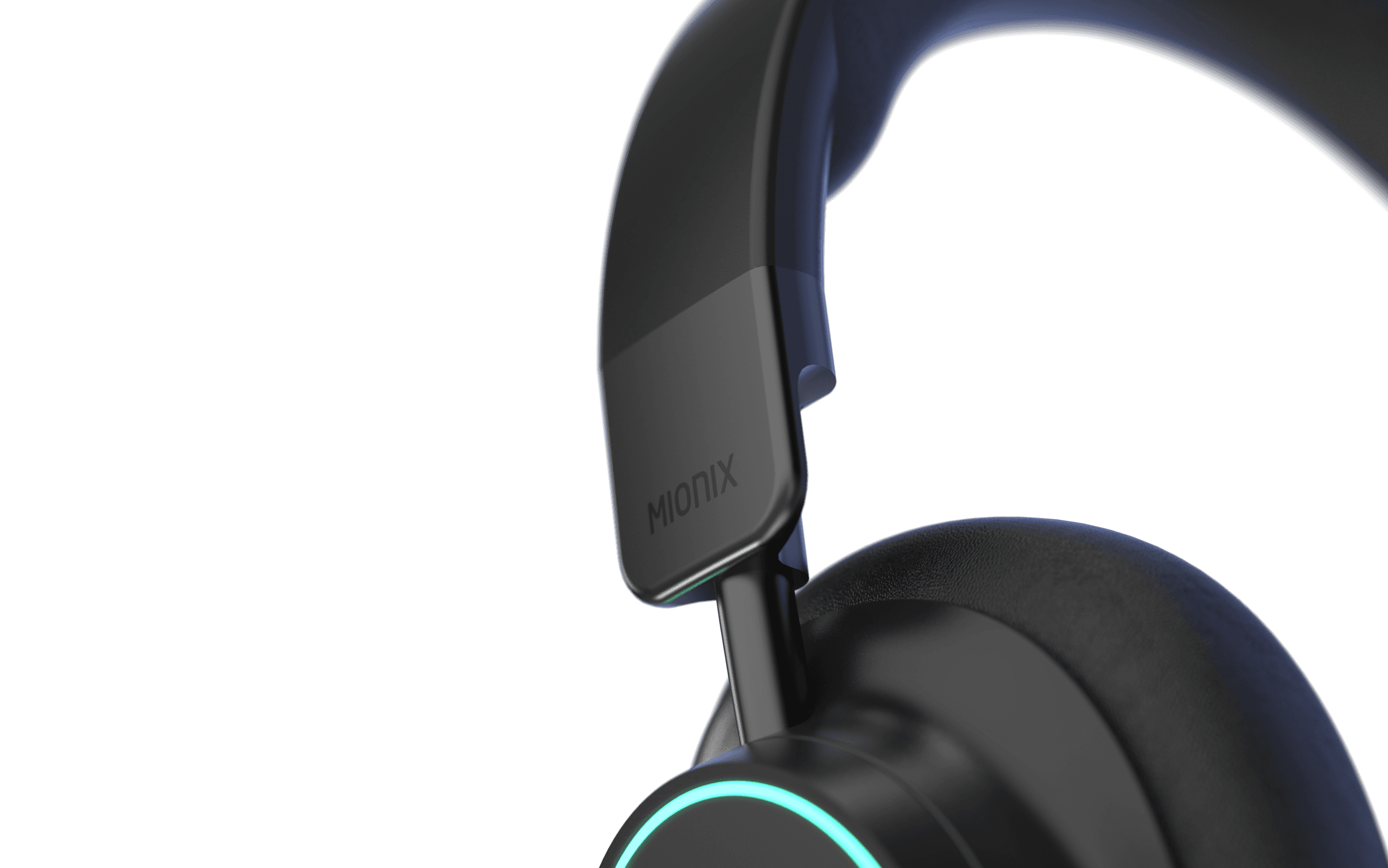
C01
Takes an expressive, mechanical approach: a sleek headband paired with a chunky, rugged earcup suspension unit, connected through a gyro-like hinge setup for maximum fit. The earcups have customizable RGB lighting around/in the Mionix logo, which also doubles as a mute indicator.

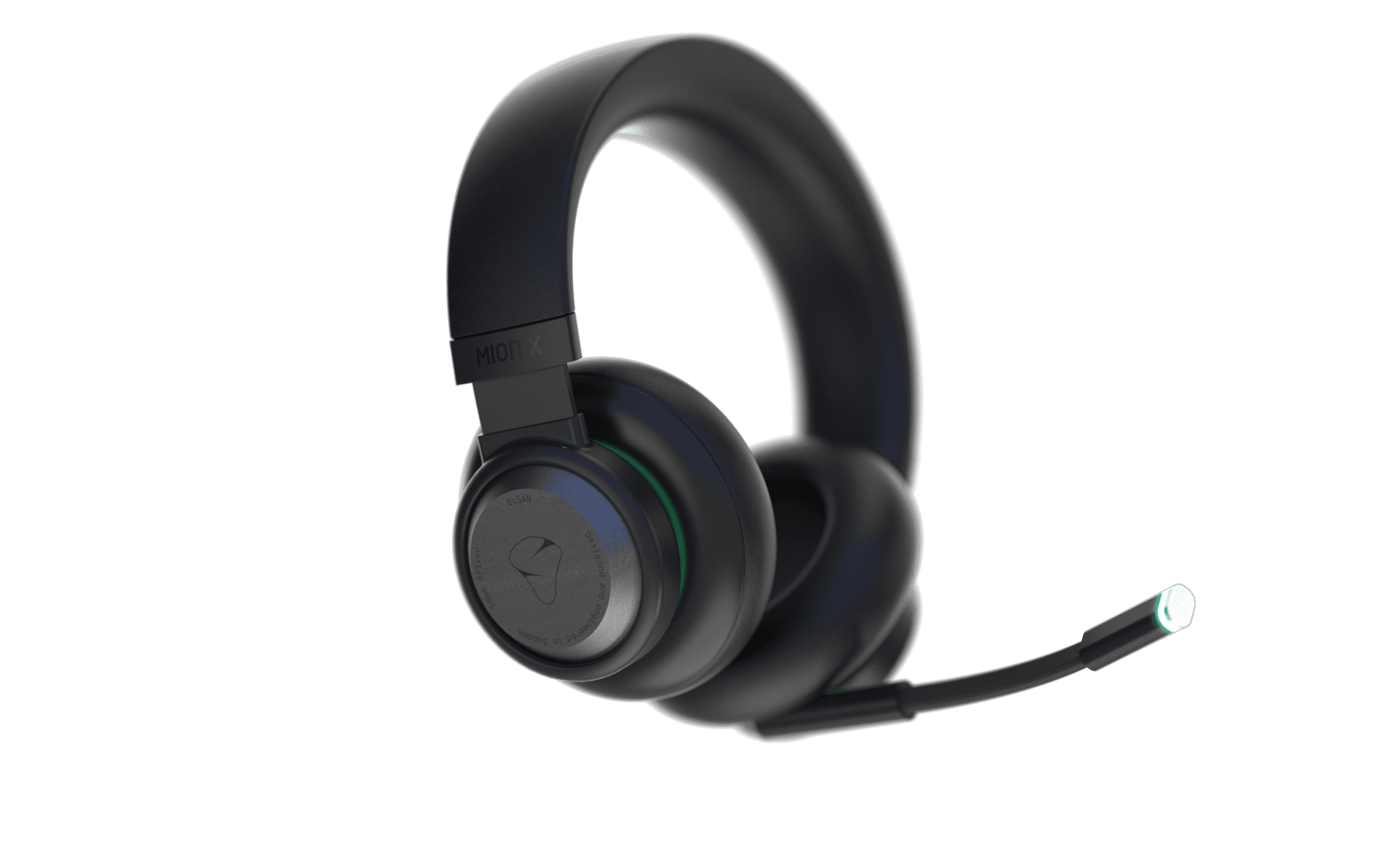
C02
Offers a more traditional, retro take, built from geometric shapes and intersections for a distinct silhouette. Indirect LED lighting gives it a gaming edge without shouting for attention, and it has a flexible metal headband construction that's proven and reliable.
C03
Brings an urban, street-inspired look, blending clean, sleek shapes with rugged proportions and contemporary styling. Squircle-shaped earpads transition into a circular end piece lit by RGB for the Mionix symbol. The mic boom doubles as a mute button by rotating it away to mute, which clearly signals to other players that the gamer is muted.


What happened next?
The project had good momentum, with conversations started with the supplier and engineering discussions was ongoing when Mionix had to pull the brake to once again prioritize resources.
SUB-PROJECT
PRODUCT LAUNCH VIZ.
ROLE:
VISUALIZER AND ANIMATOR
STATUS
USED ON ALL SO-ME CHANNELS
Brief:
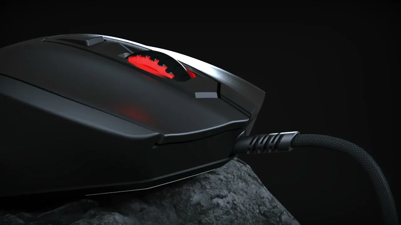
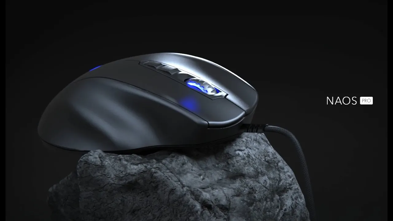
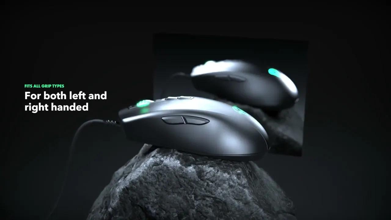
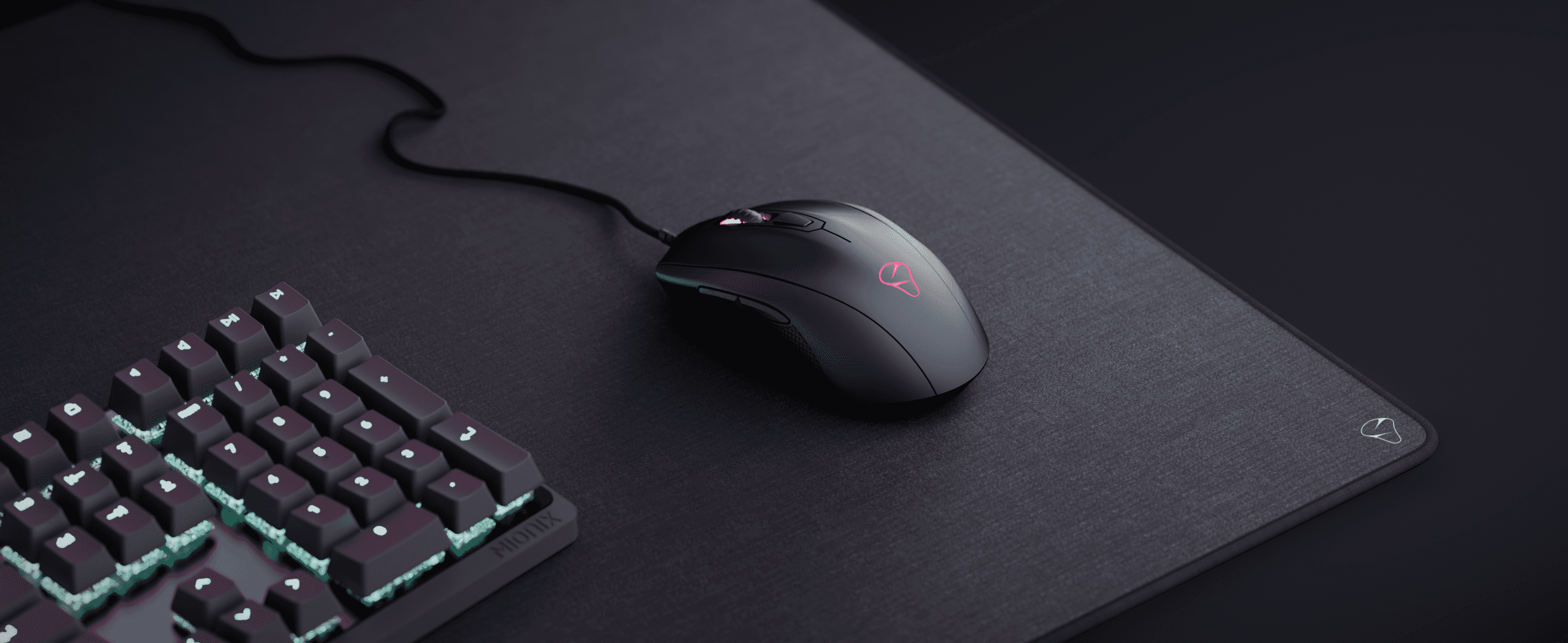
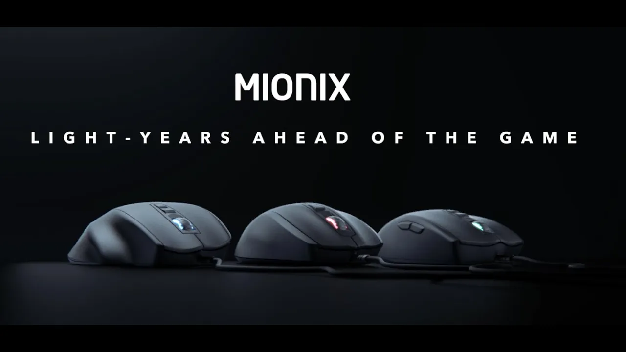
"We need help to make videos and visalizations of our new PRO range mice series. As a relaunch of the new but "old" Mionix."

Mionix wanted to leave this…
…And return to this

Talking to the guys a Mionix, it was clear that they wanted to re-establish the brand as a crafted high-end gaming accessory company, with no unnecessary fuss and focus on the core functionality.
The following is a selection of the assets that were created for the campaign.